Posts tagged rsvp
A Very Wild Wedding

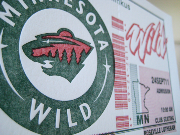
Kristen and Nicholas are super-ultimate Minnesota Wild fans.  When they approached us with the idea to turn the standard wedding invitation into something a little more edgy, the idea wheel started churning.

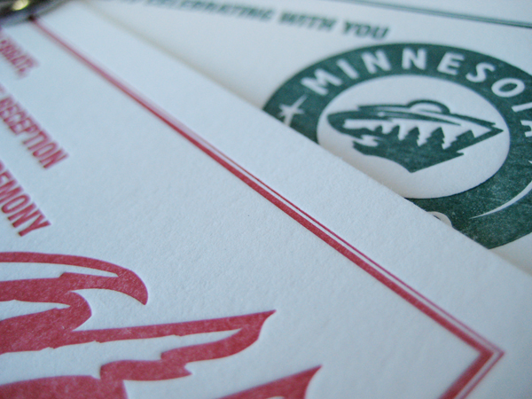
We thought: only a die hard fan would allow hockey tickets for their wedding invitations.  But not only were Kristen and Nicholas completely receptive to the idea--they loved it.  The gloves were off! To put it mildly, the ticket concept was uniquely them.  Few other invitations we've designed here in the letterpress shop can compare to the intensity of these. Two-color, color overlays, a little trapping and perforation along one side for that ticket stub look; These invites have all the bells and referee whistles!

We want to thank the couple for their creativity, trust and willingness to be a little more daring than the norm.  The results of this round of printing were incredible and wouldn't have been possible without their team spirit.  The popularity of this invitation has surpassed all our expectations, wildly popular among sports fans, travel aficionados and Minnesota natives.

Visit the letterpress blog for more sweet hi-sticking invitation awesomeness!

Affordable Letterpress Printing

Dick and Jane Letterpress offers the nations most affordable letterpress printing. Our up-front, no-hassle pricing offers brides a quick and easy browsing/shopping experience. Select your favorite design, view our prices, get a quote... it's that simple! Here are a few general rules of thumb when considering all the different sizes.

1. An A7 is the most common size for Wedding Invitations. 2. An A1 is the most common size for your rsvp. 3. While an RSVP postcard is definitely super cool - it can often be more expensive than a standard A1 and envelope because a postcard usually requires printing on both sides. 4. Can you switch up sizes for something more outside the norm... ABSOLUTELY. Just be sure to consider envelope size restrictions. 5. Accompanying cards can come in any size you want. It all depends on how much info you want to fit.

Dick and Jane Letterpress wishes you all a great wedding day!

An Oldie but a Goodie for the Letterpress Blog

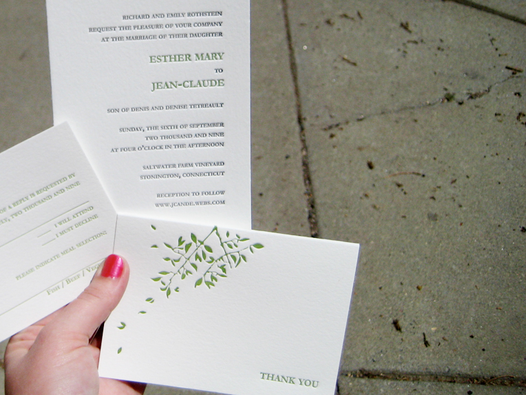
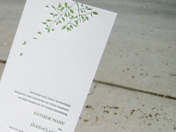
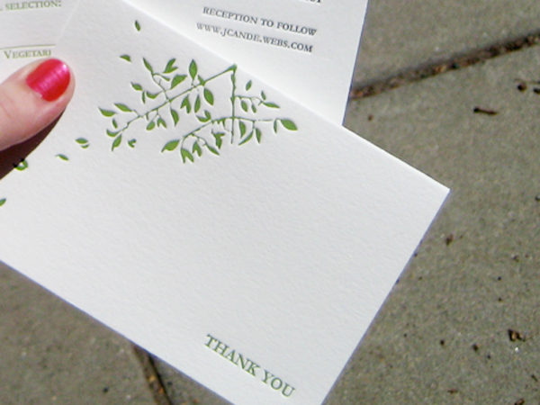
We were cleaning the shop this week. While filing away some summer orders, I came across these really cool invitations! Pictured below are the final invitation, rsvp and thank you card designs for Jean Claude and Esther. They selected our Spring Leaf II wedding collection design. After a few quick tweaks, we finalized the beautiful compositions. I can't believe I overlooked adding them to our letterpress blog. I guess I'll never know how that happened? The final letterpress wedding invitations were printed on pearl paper in a sage and dark grey ink combination. Special thanks to JC and Esther for their creative attitude and proactive approach to finalizing all the little details required to make these invitations so tasty! letterpress-invitations-jce1

letterpress-invitations-jce2

letterpress-invitations-jce3

Be sure to visit our letterpress blog often for updated images and specials on affordable letterress printing from Dick and Jane Letterpress

Traditional Meets Extraordinary Minneapolis Wedding Invitations!

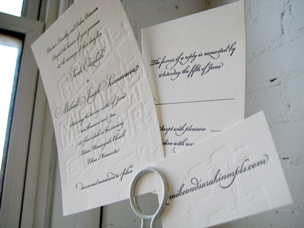
We recently finished an invitation order for the Peterson wedding. The bride and groom came in with the brides mother. The four of us sat down over a coffee and notepad where we discussed their particularly stylish taste unlike anything we had ever really attempted before.letterpress-invitations-gold1

letterpress-invitations-gold2

letterpress-invitations-gold3

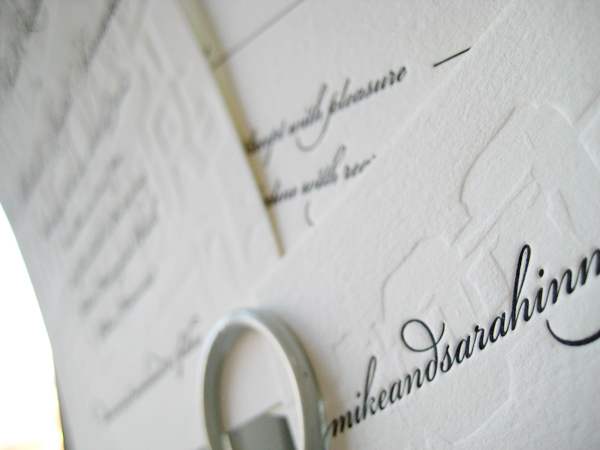
The couple expressed their adoration for the traditional calligraphy/script type style however it was obvious that the two of them were a little more daring than leaving it at that. They continued to tell me about the ceremony being held at the super cool Gold Medal Flour building in Minneapolis, MN. I had recently been looking at pictures of the giant sign still mounted to the top of the roof so I was quite familiar with the allure of the building. The Petersons wanted to somehow incorporate the building into the invitation suite but do it tastefully.

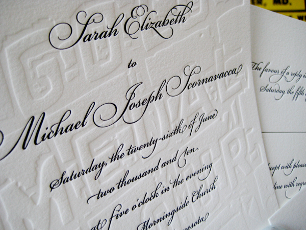
After some back and forth we came up with the pictured design. We combined a blind emboss (no-ink) with an elegant script in formal black. At first glance, the invitees would not quite notice the full-bleed Gold Medal Flour sign quietly slipped in behind the script text. Also, if you lay each piece down on the table, the pieces reassemble like a puzzle to reveal one large sign which runs the width of both the invite, rsvp, and tidbit card. This was by far one of our most fun designs of the year. Thanks so much to the Petersons for being so daring. xoxo - DJL