We worked with the Strawbridge Family on a number of projects for not one but two daughters weddings. This is just a quick glimpse of the letterpress wedding invite we recently designed for Elizabeth. The colors are totally amazing with a bubble gum and strawberry soda kind of combination. Not shown is that the rest f the pieces all fit together like a little puzzle as the bubbles float across everything from the bottom up. In the words of Rachel Zoe - "loves it." Thanks for visiting the letterpress blog!
We recently finished an invitation order for the Peterson wedding. The bride and groom came in with the brides mother. The four of us sat down over a coffee and notepad where we discussed their particularly stylish taste unlike anything we had ever really attempted before.


The couple expressed their adoration for the traditional calligraphy/script type style however it was obvious that the two of them were a little more daring than leaving it at that. They continued to tell me about the ceremony being held at the super cool Gold Medal Flour building in Minneapolis, MN. I had recently been looking at pictures of the giant sign still mounted to the top of the roof so I was quite familiar with the allure of the building. The Petersons wanted to somehow incorporate the building into the invitation suite but do it tastefully.
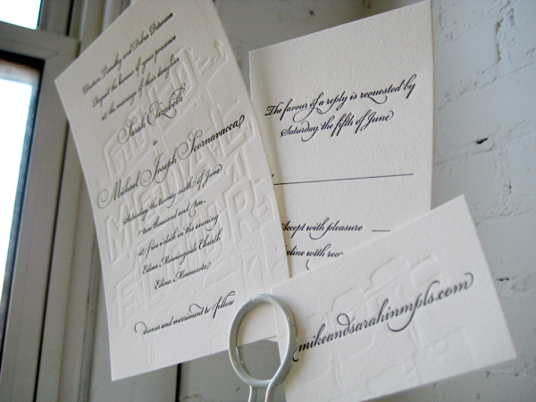
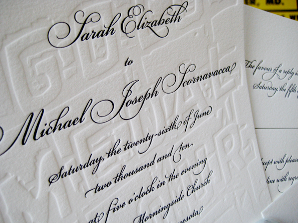
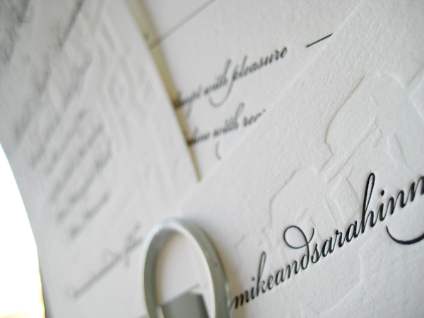
After some back and forth we came up with the pictured design. We combined a blind emboss (no-ink) with an elegant script in formal black. At first glance, the invitees would not quite notice the full-bleed Gold Medal Flour sign quietly slipped in behind the script text. Also, if you lay each piece down on the table, the pieces reassemble like a puzzle to reveal one large sign which runs the width of both the invite, rsvp, and tidbit card. This was by far one of our most fun designs of the year. Thanks so much to the Petersons for being so daring. xoxo - DJL

