Posts tagged Letterpress Invitation
Fancy Foil!

gold-foil-invitation 
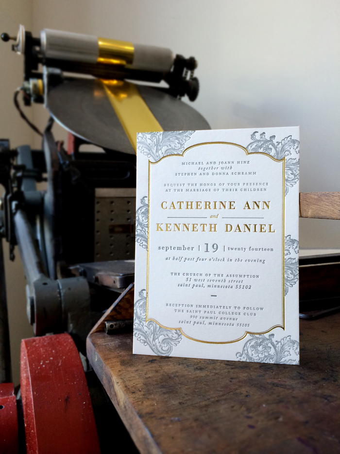
We ran these last July but today I was going through some of our archive books and found a couple left over prints. These we're absolutely one of our favorites from 2014. The interest in foil was just starting to pick up and lucky for us, Catherine and Ken we're amazing to work with. We started by looking at some examples but after talking some more about other possibilities, Catherine gave  pretty free rein to "do what we do." The final result couldn't have been more stunning. Gold foil and cool grey letterpress filigree invitation. We knocked these out on the 220 Lettra and finished everything off with a gold painted edge.


Many thanks to Catherine for giving us the opportunity to really knock one out of the park.

Minneapolis Skyline Invitation

minneapolis-skyline-invitation-1 minneapolis-skyline-invitation-2sno

These sat on the table begging to be photographed for months but we'd just been too busy to get a photo session in. Finally, we managed to make it happen this afternoon. True to our city, here's a really wonderful Minneapolis skyline wedding invitation set we did for T&M. We talked about a few different directions for the invitation set but once we worked up the art for the city skyline, the answer was clear and we ran with it! Blue on Blue duotone set with snow (since it was a winter wedding). If you're looking for an invitation design with some local flavor, perhaps this is just what you've been looking for?? Contact us today to get a quote on your letterpress wedding invitations!


Follow us on instagram for more of the day-to-day! @dickandjane_letterpress

Public Gardens

Public Gardens is perfectly playful and charming in every way! We think it is a perfect match for any of your upcoming spring and summer celebrations. Contact us today for more information or a personalized quote.

Banner01

Banner02

Bostonian Letterpress Wedding Invitation

New to our letterpress blog is this classic and elegant little piece we call "Bostonian." The scroll work is clean and combined with a great white balance as well as the option to add your own monogram to the top! The letterpress invitation is bordered with a double-pinstripe line that has a subtle elegance and frames the whole invitation quite nicely. A timeless classic ideal for any wedding.

Erin and Nick Point the Finger!

Erin came to us a few months back with a love for whimsical eclectic letterpress wedding invitations. More importantly, she required lots of pointy fingers. Her exact quote was “the more pointy fingers, the better”, and we couldn’t agree more! This invite suite incorporates seven different typestyles along with all sorts of fun quirky embellishments. Much love and appreciation to Erin and Nick for having such an amazing sense of cool. Dick and Jane Letterpress will soon be releasing an altered version to our wedding collection. xoxo - DJL