Posts tagged letterpress st paul
Put on Your Autumn Sweater!
fall-wedding-invitation-e1476120639666.jpg

Time for that Autumn Sweater!

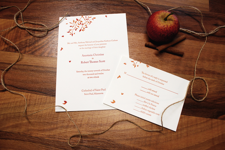
Come September it's common to find invitations featuring warm reds and browns but sometimes it's more fun to push further into the concept. Seasonal invitation designs can be approached in so many more ways! Autumn Sweater- (Seasonal Wedding Invitation Design) - is very subtle but we snuck a few season-appropriate ideas into the final concept.

We often print others design work but every now and then we're given the opportunity to really let our design skills shine. This custom designed invitation was a labor of love and we had the pleasure of adding a few fancy print features to the concept as well. We included a touch of foil along with both letterpress printing and a blind impression. The pattern in the back is similar to a knit sweater texture which naturally lent itself to the diamond-shaped center area. Once we had these elements flowing it was just a matter of selecting the right fonts! The gold foil was an elegant exchange for the usual brown colors and the silver ink spoke more directly to our cozy Minnesota trees blowing in the fall breeze. The wedding was last week and it sounds like everyone was pretty pleased (as were we).

Check out more of our designs here!

Black Foil on Black 3-ply!

photo 2-8

Another one for the books! This piece was designed by the groom and she really had her mind set on black foil over black stock with the varnish. I think we were all a little nervous if this was going to work out as well as we all had hoped. However, in the end, the invitation suite really exceed everyones expectations. This is a really great example of just how much a simple black can in-fact be quite a complex beast with a lot of shade variation. We're so grateful to Stephanie for having the guts to stick to her guns and see this black-on-black concept all the way to the end!

Can you feel it!

Maybe it's just us but around here, it's already starting to feel like spring! We've made it through the grey part of the winter and the sun is shining. We just got a picture sent from a photographer ASHLEYMICHELLE who got a fabulous shot of one of our invitation sets completed back in 2014. So much VIBE! The set features fuscia and gold foil with calligraphy, color coordinated envelopes and FANTASTIC envelope liners! I'm looking at this arrangement as a whole and it's a real marvel. Thanks so much to the client and photography studio for sending this over. - You're the best!

Baltimore-Wedding-Photographer-110

click image to view full size!

Apples & Cinnamon

round 2  

We did this fall wedding duotone set for Anastasia and Robert around this time last year. The set had been photographed and ended up being used in a few displays for wedding shows. Meanwhile, we completely overlooked adding a pic to the blog for all to enjoy. The set was based on our Spring Leaf design and produced on a natural white paper with a wonderful fall color pallet. An absolutely darling invite suite for a fantastic couple!